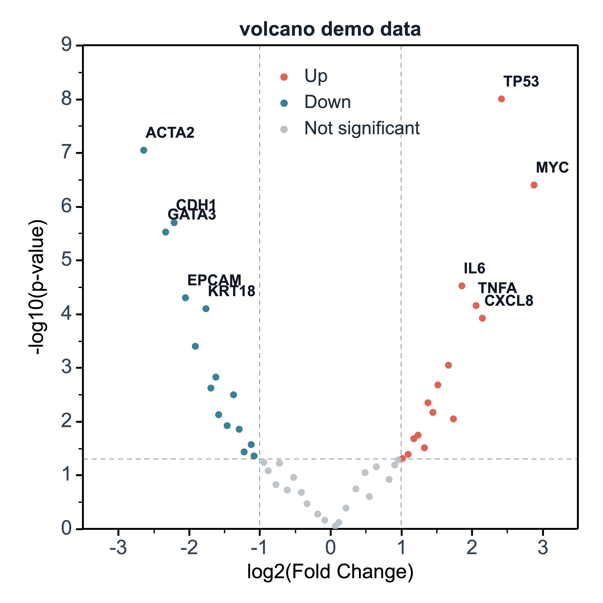
Volcano Plot

A volcano plot uses log2 fold change on the X axis and p-value significance on the Y axis.

Prepare a directly mappable table

Volcano plots need one log2FC column and one p-value or adjusted p-value column.

The example table uses volcano_demo_data with 50 rows and 6 columns. Three columns are mapped: log2FC, p_value, and gene label.

Practice data · illustrates column structure
genelog2FCp_value
Gene A2.40.001
Gene B1.30.018
Gene C0.20.62
Gene D-1.50.009
Gene E-2.10.0004

Create a volcano plot

In the Create Figure panel, map the log2FC column, significance column, and optional label column. SmartPlot creates the volcano plot from those mapped columns.

Step 1

Choose analysis data

Confirm the data range, then choose a new figure or add the plot to an existing figure.

Volcano Plot setupInterface preview · non-interactive
MenuPlot → Volcano Plot
Data range

Full table: 5 rows, 3 columns

Output

New figure

Add to existing figure

Volcano Plot setupInterface preview · non-interactive
log2FC column
log2FC · X
Significance column
p_value · Y
Label column
gene · Label
Step 2

Map fold change and significance

Map log2FC column, Significance column, Label column in order, making sure each selected column has the intended table role.

Step 3

Set labels and groups

Set Significance source, Group column, Point size column for the table structure and confirm that the choices match the intended reading.

Volcano Plot setupInterface preview · non-interactive
Significance source
p-value column
Group column
Automatic
Point size column
None
Volcano Plot setupInterface preview · non-interactive
Show threshold lines
Label significant points only
Data tableDifferential analysis practice data
Mapped columns3
Step 4

Review and create

Check Show threshold lines, Label significant points only, review the mapped-column count, then choose Create figure.

Settings and pre-export checks

  • log2FC column
  • Significance source
  • Significance column
  • Label column
  • Group column
  • Point size column
  • Use adjusted p-values when they are available.
  • Check that p-values are positive before plotting.
  • Avoid labeling every point in dense datasets.
  • Keep threshold lines visible when explaining cutoffs.
  • Use color choices that remain readable in print.
Continue to styling →