Lollipop Plot
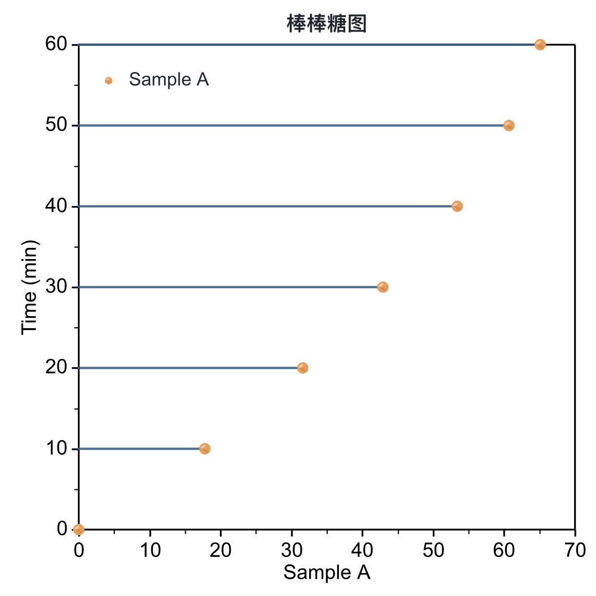 Lollipop Plot
A lollipop plot combines a thin stem with a marker at each value, making ordered comparisons lighter than a filled bar chart.
Prepare a directly mappable table
Use ordered or categorical positions with one or more numeric value series, especially when the marker values deserve more emphasis than filled area.
Prepare an X or category column and one or more numeric value columns. Optional error columns can be mapped when uncertainty is available.
Practice data · illustrates column structure| sample | value | error |
|---|
| A | 42 | 2.1 |
| B | 36 | 1.8 |
| C | 29 | 1.5 |
| D | 21 | 1.2 |
| E | 13 | 0.9 |
Create a lollipop plot
Choose vertical or horizontal stems, map a shared X or paired X-Y structure, and connect each value to the selected baseline.
Step 1Choose range and output
Confirm the data range, then choose a new figure or add the plot to an existing figure.
Lollipop Plot setupInterface preview · non-interactive
×MenuPlot → Lollipop Plot
Data rangeFull table: 5 rows, 3 columns
OutputNew figure
Add to existing figure
Lollipop Plot setupInterface preview · non-interactive
×Error barserror · Y Error⌄
Map positions and values
Map X column, Value column, Error bars in order, making sure each selected column has the intended table role.
Step 3Set orientation and structure
Set Orientation, X mapping for the table structure and confirm that the choices match the intended reading.
Lollipop Plot setupInterface preview · non-interactive
×OrientationVerticalHorizontal
X mappingShared XPaired X-Y
Lollipop Plot setupInterface preview · non-interactive
×✓Connect to zero baseline
✓Show data markers
Data tableRanked comparison practice data
Mapped columns3
Review and create
Check Connect to zero baseline, Show data markers, review the mapped-column count, then choose Create figure.
Settings and pre-export checks
- Vertical or horizontal orientation
- Shared X or paired X-Y
- Baseline position
- Stem width and style
- Marker shape and size
- Glossy marker effect
- Sort categories when order carries meaning.
- Keep the baseline visible and choose a range that does not exaggerate differences.
- Use restrained stem widths so markers remain the visual focus.
- Check overlap when several series share the same positions.
- Use horizontal orientation for long category labels or rank-style comparisons.