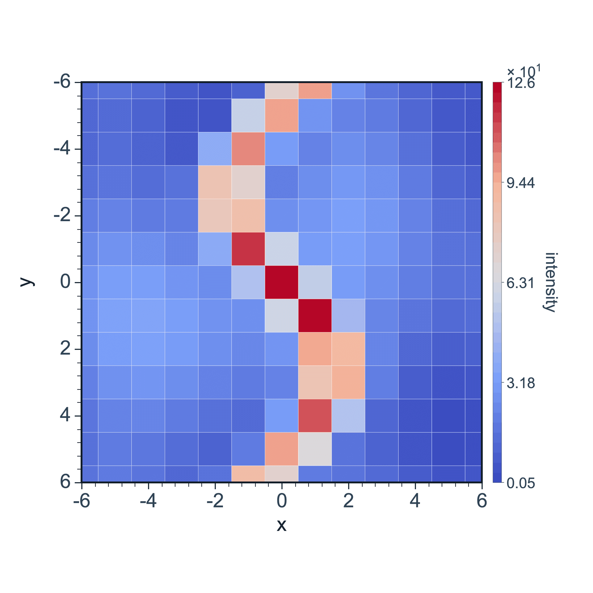
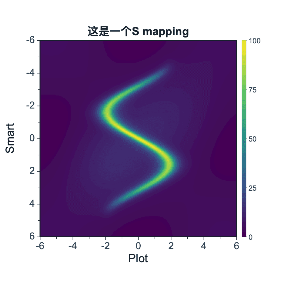
A 2D color map displays numeric intensity values across a two-dimensional coordinate plane. It is useful for mapped signals, grids, matrices, and spatial measurements.
Prepare a directly mappable table
2D color maps require X and Y coordinates plus a numeric intensity value. The data can describe signal, temperature, concentration, current, or another measured field.
Use XYZ columns for point records. For Matrix Input, the current selection is used as the Z-value matrix, and X/Y coordinates are configured separately.
Practice data · illustrates column structure
x
y
intensity
0
0
0.8
1
0
1.2
2
0
2.1
0
1
1.0
1
1
3.5
2
1
7.2
Create a 2D color map
Click Data from the top menu and choose 2D Color Map. SmartPlot opens the 2D Color Map setup window.
Step 1
Choose range and output
Confirm the data range, then choose a new figure or add the plot to an existing figure.
2D Color Map setupInterface preview · non-interactive
×
MenuPlot → 2D Color Map
Data range
Full table: 6 rows, 3 columns
Output
New figure
Add to existing figure
2D Color Map setupInterface preview · non-interactive
×
X column
x · X⌄
Y column
y · Y⌄
Z / color column
intensity · Z⌄
Step 2
Map 2D coordinates
Map X column, Y column, Z / color column in order, making sure each selected column has the intended table role.
Step 3
Choose format and display
Set Data format, Display mode, Coordinate source for the table structure and confirm that the choices match the intended reading.
2D Color Map setupInterface preview · non-interactive
×
Data format
XYZ columnsMatrix input
Display mode
Interpolated image⌄
Coordinate source
XYZ columns⌄
2D Color Map setupInterface preview · non-interactive
×
✓X/Y coordinates mapped
✓Z values are numeric
Data table2D field practice data
Mapped columns3
Step 4
Review and create
Check X/Y coordinates mapped, Z values are numeric, review the mapped-column count, then choose Create figure.
Settings and pre-export checks
Colormap
Colorbar visibility
Color range
Grid display
Square-cell display
Reverse colormap
Keep the colorbar visible when the figure needs quantitative interpretation.
Use a color range that does not hide weak but meaningful signals.
Avoid overly smooth interpolation when the source data is grid-based.
Make sure X and Y spacing match the intended measurement grid.
Use color palettes that remain readable in print and for color-sensitive readers.