Scatter Plot

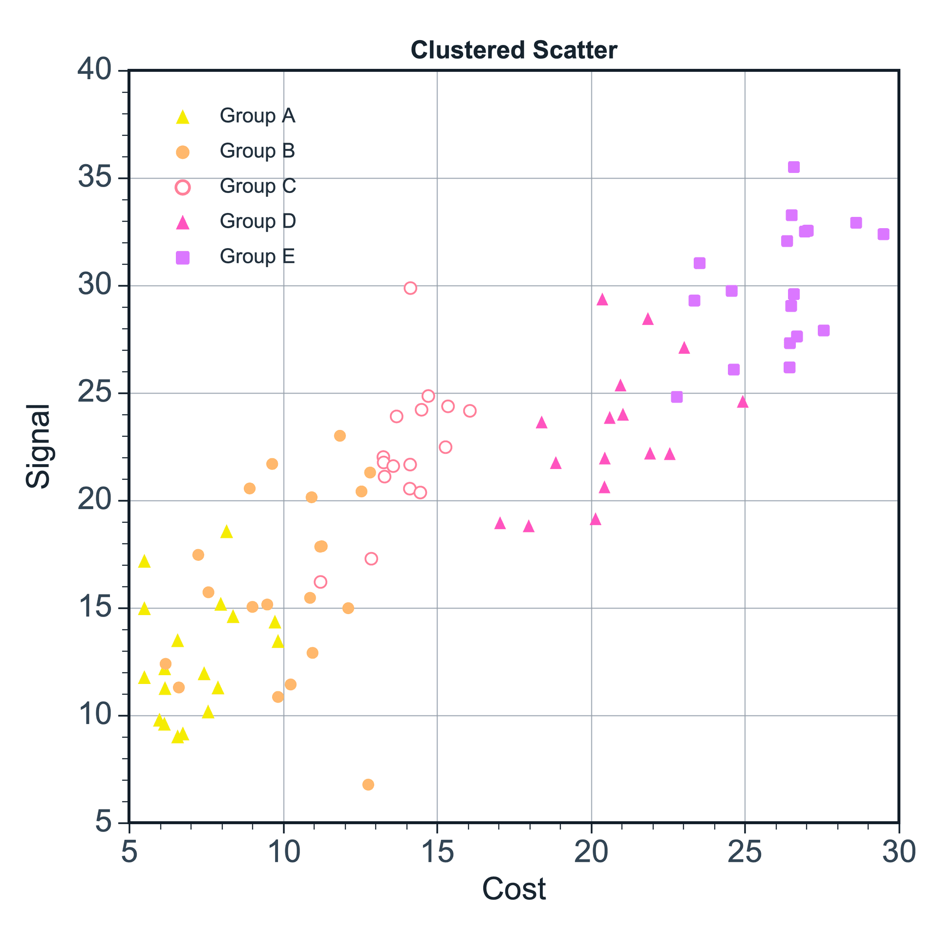
A scatter plot shows the relationship between two variables and is useful for distributions, correlations, grouped samples, and outlier inspection.

Prepare a directly mappable table

Scatter plots work best with paired X and Y values. X and Y are usually numeric variables such as cost and signal, voltage and current, or concentration and response.

Use one X column and one or more value columns. If you want to distinguish groups, prepare an optional group column for color or marker grouping when supported. A label column can be used when points need text labels.

Practice data · illustrates column structure
concentrationresponsegroup
12.1Control
23.8Control
35.2Treatment
47.4Treatment
58.1Treatment

Create a scatter plot

After editing your data, select the data range you want to plot, or use the full table directly. Click the top Plot button and choose Scatter Plot. SmartPlot opens the Create Figure dialog.

Step 1

Choose range and output

Confirm the data range, then choose a new figure or add the plot to an existing figure.
Scatter Plot setupInterface preview · non-interactive
MenuPlot → Scatter Plot
Data range

Full table: 5 rows, 3 columns

Output

New figure

Add to existing figure

Scatter Plot setupInterface preview · non-interactive
X column
concentration · X
Value column
response · Y
Group column
group · Group
Step 2

Map X, Y, and groups

Map X column, Value column, Group column in order, making sure each selected column has the intended table role.

Step 3

Set point organization

Set X mapping, Error bars, Label column for the table structure and confirm that the choices match the intended reading.

Scatter Plot setupInterface preview · non-interactive
X mapping
Shared XPaired X-Y
Error bars
None
Label column
None
Scatter Plot setupInterface preview · non-interactive
Show points
Color by group
Data tableVariable relationship practice data
Mapped columns3
Step 4

Review and create

Check Show points, Color by group, review the mapped-column count, then choose Create figure.

Settings and pre-export checks

  • Marker size
  • Marker shape
  • Marker color
  • Opacity
  • Legend
  • Axis range
  • Scatter plots are better than line plots when X values are not ordered or not continuous.
  • For dense data, use smaller markers or transparency.
  • Avoid using too many marker shapes in one figure.
  • If you need to show a trend, add a trend line only when it helps interpretation.
  • Check outliers before drawing conclusions from a correlation.
Continue to styling →