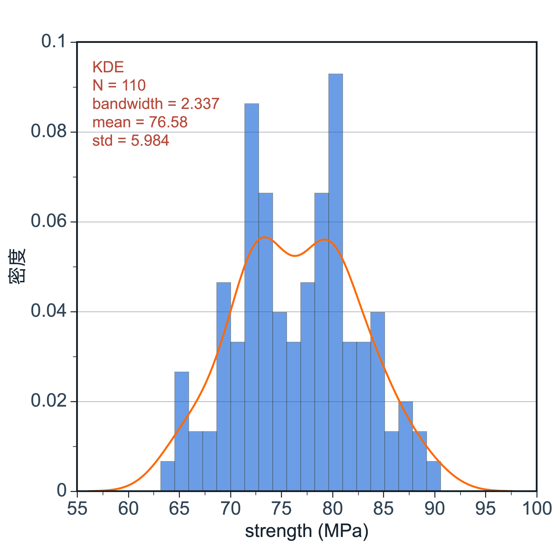
A histogram shows how numeric values are distributed. It helps reveal frequency, spread, central tendency, skewness, and multimodal patterns.
Prepare a directly mappable table
Histograms require a numeric value column with enough observations to estimate a distribution. The data can be strength, particle size, lifetime, intensity, or another continuous measurement.
Use one numeric column. If you want to compare groups, prepare an optional group column for overlay or separate displays when supported.
Practice data · illustrates column structure
measurement
group
12.1
A
12.8
A
13.4
A
14.2
B
15.1
B
16.0
B
16.8
B
Create a histogram
After preparing your data, click the top Plot button, open Statistical Plot, and choose Histogram. SmartPlot opens the Create Figure dialog.
Step 1
Choose range and output
Confirm the data range, then choose a new figure or add the plot to an existing figure.