Radar Chart

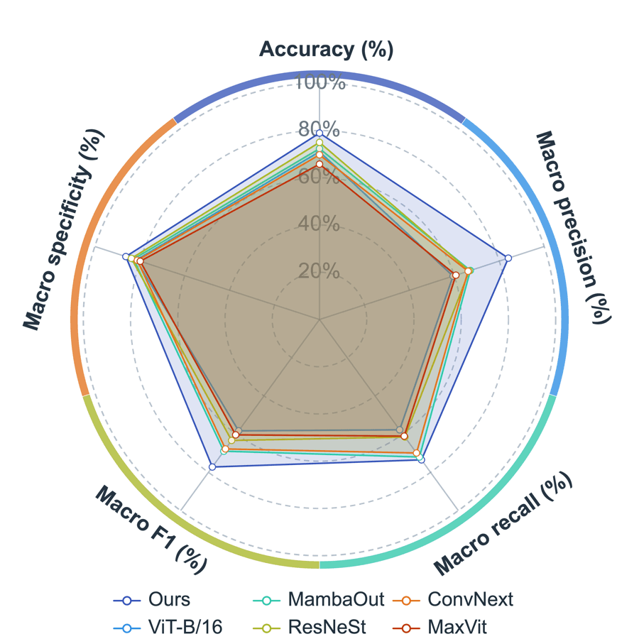
A radar chart compares multiple objects across shared metrics by placing each metric on a radial axis. It is useful for model comparison, sample scoring, multi-index evaluation, and performance summaries.

Prepare a directly mappable table

Radar charts need several comparable numeric metrics for each object. The metrics should use a consistent scale or be normalized before plotting.

In wide tables, each row can be one object and each metric can be one numeric column. In column-oriented tables, each object can be a column. In long tables, prepare object, metric, and value fields.

Practice data · illustrates column structure
methodaccuracyprecisionrecall
Model A0.910.880.86
Model B0.870.920.84
Model C0.890.850.93

Create a radar chart

Use a radar chart when you need to compare several methods, samples, or groups across the same set of metrics. Choose the data layout first, then map the object labels and radar axes.

Step 1

Choose range and output

Confirm the data range, then choose a new figure or add the plot to an existing figure.

Radar Chart setupInterface preview · non-interactive
MenuPlot → Radar Chart
Data range

Full table: 3 rows, 4 columns

Output

New figure

Add to existing figure

Radar Chart setupInterface preview · non-interactive
Object column
method · Label
Axis metric columns
accuracy, precision, recall
Step 2

Choose objects and metrics

Map Object column, Axis metric columns in order, making sure each selected column has the intended table role.

Step 3

Confirm data layout

Set Data layout for the table structure and confirm that the choices match the intended reading.

Radar Chart setupInterface preview · non-interactive
Data layout
Objects in rowsObjects in columns
Radar Chart setupInterface preview · non-interactive
At least three numeric metrics
Metric direction is consistent
Data tableMulti-metric practice data
Mapped columns2
Step 4

Review and create

Check At least three numeric metrics, Metric direction is consistent, review the mapped-column count, then choose Create figure.

Settings and pre-export checks

  • Data layout
  • Object column
  • Axis metric columns
  • Radial axis range
  • Grid rings
  • Line and fill style
  • Select at least 3 numeric metrics so the radar shape is meaningful.
  • Do not mix metrics with very different units unless they are normalized.
  • Keep the number of objects limited when filled areas overlap.
  • Use transparent fills and clear outlines for comparison.
  • Check that higher values always mean the same interpretation across axes.
Continue to styling →