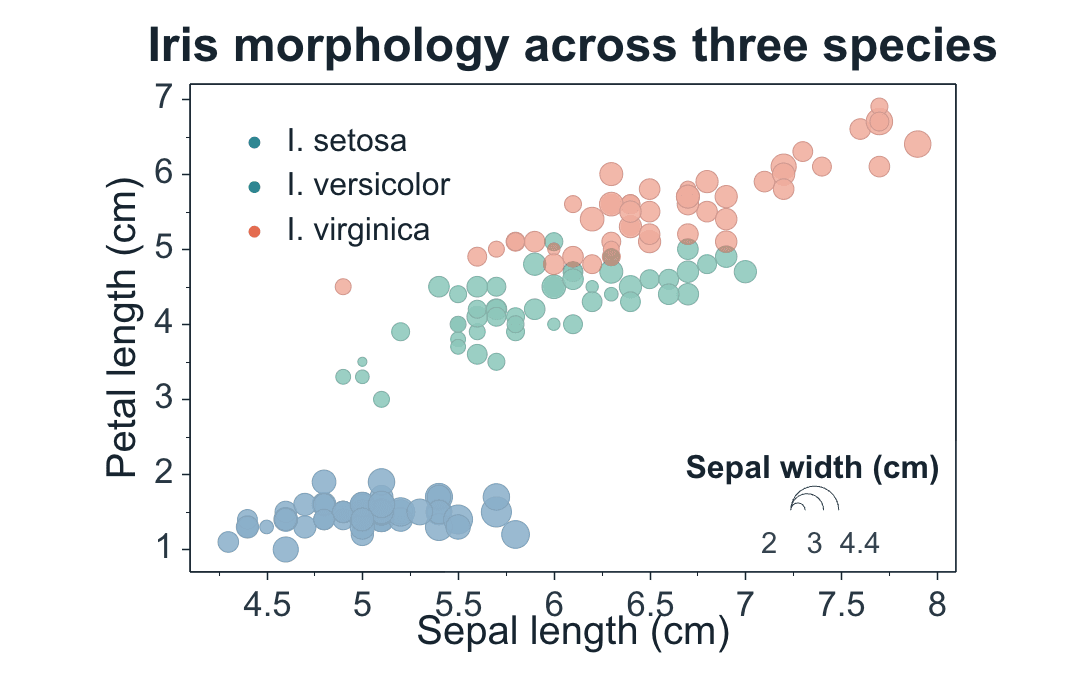
A bubble chart extends a scatter plot by mapping a third numeric variable to marker size. It is useful when position explains two variables and bubble area or radius needs to show magnitude, abundance, weight, or another quantitative measurement.
Prepare a directly mappable table
Use paired numeric X and Y values plus a non-negative numeric size variable. An optional group column can separate categories by color, and an optional label column can identify selected points.
Prepare at least one X column, one value column, and one bubble-size column. Shared X supports several Y series using one X column; Paired X-Y is suitable when each series owns its X values. Keep the size column on a meaningful numeric scale and check missing or extreme values before plotting.
Practice data · illustrates column structure
x
y
magnitude
group
1
2.1
12
A
2
3.8
28
A
3
5.2
46
B
4
7.4
72
B
5
8.1
95
C
Create a bubble chart
Choose Bubble from Plot → Basic XY, then map X, value, and bubble-size columns. SmartPlot uses the third numeric variable to scale each marker while preserving the familiar XY workflow.
Step 1
Choose range and output
Confirm the data range, then choose a new figure or add the plot to an existing figure.