Box Plot
 Box Plot
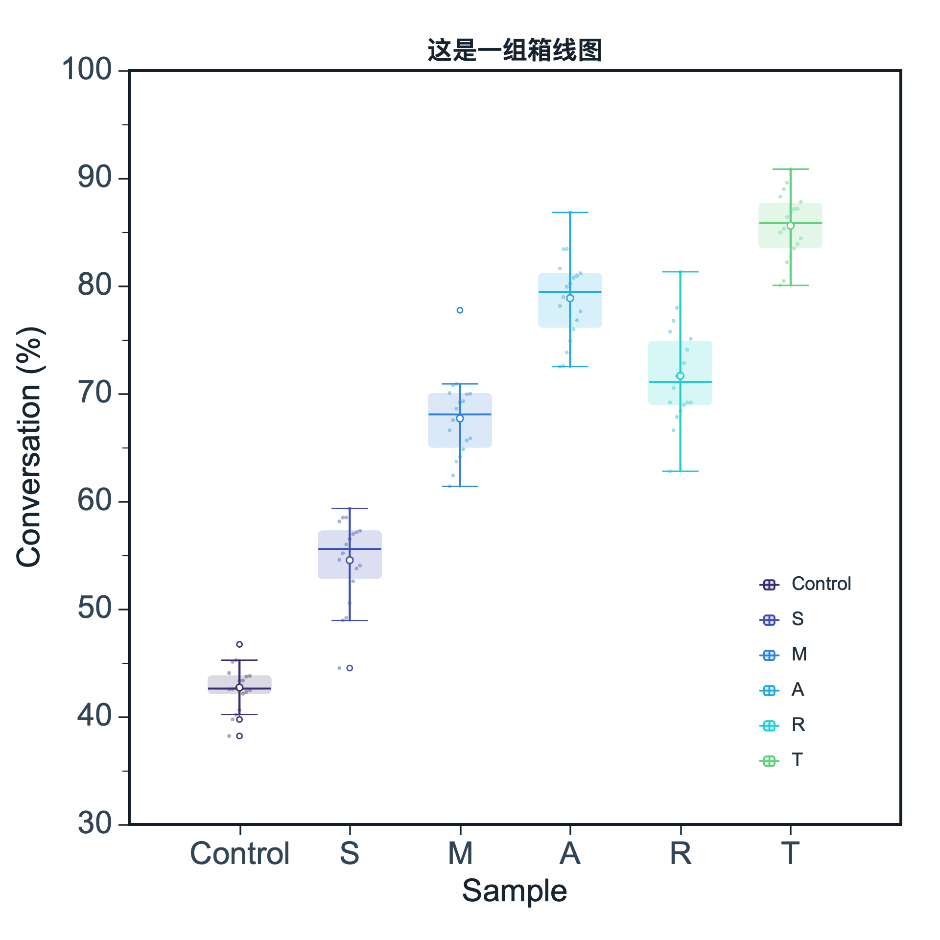
A box plot summarizes statistical distributions and makes group comparisons easier. It shows median, quartile range, whiskers, and potential outliers.
Prepare a directly mappable table
Box plots are suitable for grouped numeric measurements, such as conversion values across samples or response values across treatment groups.
Use one group column and one numeric value column. Each group should contain enough values for a meaningful distribution summary.
Practice data · illustrates column structure| group | value |
|---|
| Control | 12.1 |
| Control | 13.4 |
| Control | 11.8 |
| Treatment | 17.2 |
| Treatment | 18.6 |
| Treatment | 16.9 |
Create a box plot
After preparing your data, click the top Plot button, open Statistical Plot, and choose Box Plot. SmartPlot opens the Create Figure dialog.
Step 1Choose range and output
Confirm the data range, then choose a new figure or add the plot to an existing figure.
Box Plot setupInterface preview · non-interactive
×MenuPlot → Box Plot
Data rangeFull table: 6 rows, 2 columns
OutputNew figure
Add to existing figure
Box Plot setupInterface preview · non-interactive
×Group columngroup · Group⌄
Map values and groups
Map Value column, Group column in order, making sure each selected column has the intended table role.
Step 3Set box statistics
Set Orientation, Whisker rule for the table structure and confirm that the choices match the intended reading.
Box Plot setupInterface preview · non-interactive
×OrientationVerticalHorizontal
Box Plot setupInterface preview · non-interactive
×✓Show outliers
Show raw points
Data tableGrouped distribution practice data
Mapped columns2
Review and create
Check Show outliers, Show raw points, review the mapped-column count, then choose Create figure.
Settings and pre-export checks
- Value columns
- Group column
- Show points
- Show mean
- Show outliers
- Box and axis styling
- Each group should have enough observations for a stable summary.
- Box plots hide individual data density, so raw point overlay can be helpful when supported.
- Use the same units across groups.
- If there are many groups, increase figure width or rotate labels.
- Check whether outliers represent real signals or data issues.