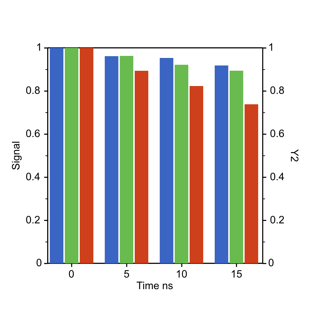
A dual Y bar chart compares categorical values when one or more series use a different scale or unit.
Prepare a directly mappable table
Use it for categorical groups with two or more numeric series, especially when one series would be unreadable on the same Y range.
Prepare one category column and at least two numeric value columns. Each value column can be assigned to Left Y or Right Y.
Practice data · illustrates column structure
month
rainfall
temperature
Jan
42
8.1
Apr
76
16.4
Jul
118
28.7
Oct
64
18.2
Create a dual Y bar chart
Use the Dual Y bar chart mode when categories are shared but value columns belong to different scales. SmartPlot lets you assign each series to the left or right Y axis before creating the figure.
Step 1
Choose range and output
Confirm the data range, then choose a new figure or add the plot to an existing figure.
Dual Y Bar Chart setupInterface preview · non-interactive
×
MenuPlot → Dual Y Bar Chart
Data range
Full table: 4 rows, 3 columns
Output
New figure
Add to existing figure
Dual Y Bar Chart setupInterface preview · non-interactive
×
Category column
month · X⌄
Value columns
rainfall, temperature · Y⌄
Step 2
Map category and series
Map Category column, Value columns in order, making sure each selected column has the intended table role.
Step 3
Assign left and right Y axes
Set Orientation, rainfall, temperature for the table structure and confirm that the choices match the intended reading.
Dual Y Bar Chart setupInterface preview · non-interactive
×
Orientation
VerticalHorizontal
rainfall
Left Y axis⌄
temperature
Right Y axis⌄
Dual Y Bar Chart setupInterface preview · non-interactive
×
✓Both axis units are labelled
✓Legend matches axis sides
Data tableDual-scale practice data
Mapped columns2
Step 4
Review and create
Check Both axis units are labelled, Legend matches axis sides, review the mapped-column count, then choose Create figure.
Settings and pre-export checks
Vertical or horizontal direction
Normal or grouped bars
Category column
Value columns
Left Y / Right Y assignment
Axis range and title
Use a dual axis only when the scales or units are genuinely different.
Label both axes clearly so readers know which series belongs to each side.
Avoid comparing bar heights directly across different Y axes.
When values share the same unit, a normal grouped bar chart is usually clearer.
Check horizontal layouts after plotting so axis titles, legends, and labels have enough room.