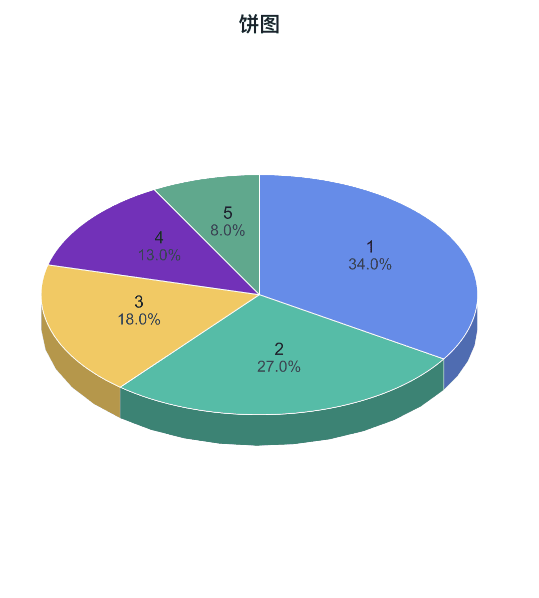
A pie chart shows how a small number of categories contribute to a whole. Standard pie, donut, and 3D presentation are Free; detail and variable-form styles require Plus.
Prepare a directly mappable table
Use a small set of mutually exclusive categories with non-negative values that share one meaningful total.
Prepare one category column and one numeric value column. Duplicate category labels are combined; negative values cannot form slices and zero values do not create visible sectors.
Practice data · illustrates column structure
category
value
Sample A
40
Sample B
28
Sample C
18
Sample D
12
Sample E
8
Create a pie chart
Map one category column and one non-negative value column, then choose a pie or donut layout and standard 2D or 3D presentation.
Step 1
Choose range and output
Confirm the data range, then choose a new figure or add the plot to an existing figure.
Pie Chart setupInterface preview · non-interactive
×
MenuPlot → Pie Chart
Data range
Full table: 5 rows, 2 columns
Output
New figure
Add to existing figure
Pie Chart setupInterface preview · non-interactive
×
Category column
category · Group⌄
Value column
value · Y⌄
Step 2
Map category and value
Map Category column, Value column in order, making sure each selected column has the intended table role.
Step 3
Choose pie presentation
Set Shape, Rendering for the table structure and confirm that the choices match the intended reading.
Pie Chart setupInterface preview · non-interactive
×
Shape
PieDonut
Rendering
2D3D
Pie Chart setupInterface preview · non-interactive
×
✓Merge duplicate categories
✓All values are non-negative
Data tableComposition practice data
Mapped columns2
Step 4
Review and create
Check Merge duplicate categories, All values are non-negative, review the mapped-column count, then choose Create figure.
Settings and pre-export checks
Pie or donut
2D or 3D view
Category and value labels
Percentages
Leader lines
Slice colors and borders
Keep the category count small so differences remain readable.
Use a bar chart when precise comparison matters more than part-to-whole composition.
Verify that all values belong to the same total and unit.
Do not use negative values; check missing and zero values before plotting.
Standard 3D presentation is Free, but avoid perspective when it could distort comparison.