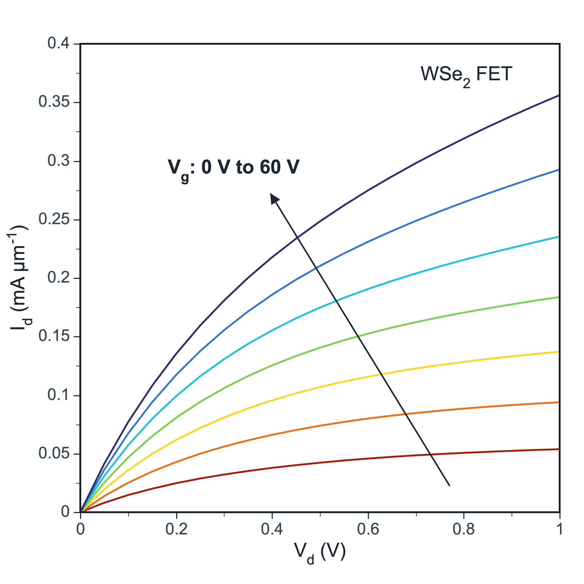
A line plot shows how values change along a continuous variable. It is suitable for time series, voltage scans, wavelength-dependent data, temperature-dependent data, and multi-sample trend comparison.
Prepare a directly mappable table
Line plots are suitable for data with a continuous X axis, such as time, voltage, temperature, wavelength, energy, or cycle number. The Y axis usually represents measured values such as current, intensity, conversion, absorbance, or response signal.
Use one X column and one or more Y columns. Multiple curves can be created from multiple Y columns, or from a group column when using long-format data. Optional error bar columns can be added when uncertainty values are available.
Practice data · illustrates column structure
time_s
sample_A
sample_B
0
1.2
1.0
1
2.8
2.1
2
4.4
3.7
3
5.1
4.8
4
6.7
6.0
Create a line plot
After editing your data, select the range you want to plot in the data table, or create the plot from the full table. Click the top Plot button and choose Line Plot. SmartPlot opens the Create Figure dialog.
Step 1
Choose range and output
Confirm the data range, then choose a new figure or add the plot to an existing figure.
Line Plot setupInterface preview · non-interactive
×
MenuPlot → Line Plot
Data range
Full table: 5 rows, 3 columns
Output
New figure
Add to existing figure
Line Plot setupInterface preview · non-interactive
×
X column
time_s · X⌄
Value columns
sample_A, sample_B · Y⌄
Error bars
None⌄
Step 2
Map X and values
Map X column, Value columns, Error bars in order, making sure each selected column has the intended table role.
Step 3
Set connection and structure
Set X mapping, Connection, Group column for the table structure and confirm that the choices match the intended reading.
Line Plot setupInterface preview · non-interactive
×
X mapping
Shared XPaired X-Y
Connection
Line⌄
Group column
None⌄
Line Plot setupInterface preview · non-interactive
×
✓X values are ordered
✓Series use consistent units
Data tableTime-series practice data
Mapped columns3
Step 4
Review and create
Check X values are ordered, Series use consistent units, review the mapped-column count, then choose Create figure.
Settings and pre-export checks
Line width
Line style
Color
Markers
Marker size
Axis range
The X column should usually be continuous numeric data.
If X values are not ordered, sort them before plotting.
Multiple curves should use consistent units.
If there are very few data points, a scatter plot may be more appropriate.
For many curves, use clear colors and legends to avoid visual clutter.