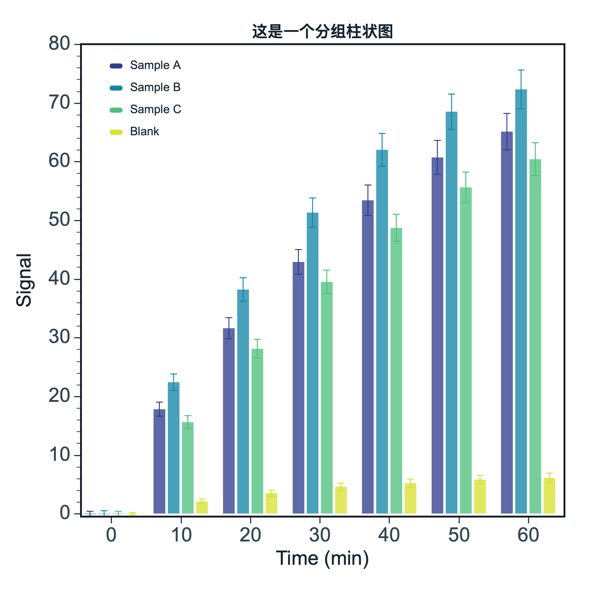
A bar chart compares values across categories. It is useful for sample comparison, condition comparison, and showing summarized values such as averages.
Prepare a directly mappable table
Bar charts are suitable for categorical X data and numeric Y values. Categories can be sample names, treatment groups, time points, or experimental conditions.
Use one category column and one value column. If your data includes uncertainty, prepare an optional error column when error bars are supported.
Practice data · illustrates column structure
condition
mean
error
Control
12.4
0.8
Low
18.7
1.1
Medium
25.2
1.4
High
31.6
1.7
Create a bar chart
After editing your data, click the top Plot button and choose Bar Chart. SmartPlot opens the Create Figure dialog. Bar charts support both normal bars and grouped bars.
Step 1
Choose range and output
Confirm the data range, then choose a new figure or add the plot to an existing figure.
Bar Chart setupInterface preview · non-interactive
×
MenuPlot → Bar Chart
Data range
Full table: 4 rows, 3 columns
Output
New figure
Add to existing figure
Bar Chart setupInterface preview · non-interactive
×
Category column
condition · X⌄
Y value column
mean · Y⌄
Error bars
error · Y Error⌄
Step 2
Map category and value
Map Category column, Y value column, Error bars in order, making sure each selected column has the intended table role.
Step 3
Choose bar structure
Set Chart type for the table structure and confirm that the choices match the intended reading.
Bar Chart setupInterface preview · non-interactive
×
Chart type
Normal barsGrouped bars
Bar Chart setupInterface preview · non-interactive
×
✓Category labels are readable
✓Zero baseline is visible
Data tableCategory comparison practice data
Mapped columns3
Step 4
Review and create
Check Category labels are readable, Zero baseline is visible, review the mapped-column count, then choose Create figure.
Settings and pre-export checks
Normal bar chart
Grouped bar chart
Category column
Y value column
Error bars
Bar and axis styling
Use bar charts for summarized values, not for hiding raw distributions.
Keep category names readable and rotate labels if needed.
Use a restrained color palette for many categories.
If the data is a distribution, consider a box plot or histogram instead.
Make sure the baseline and axis range do not exaggerate differences.